
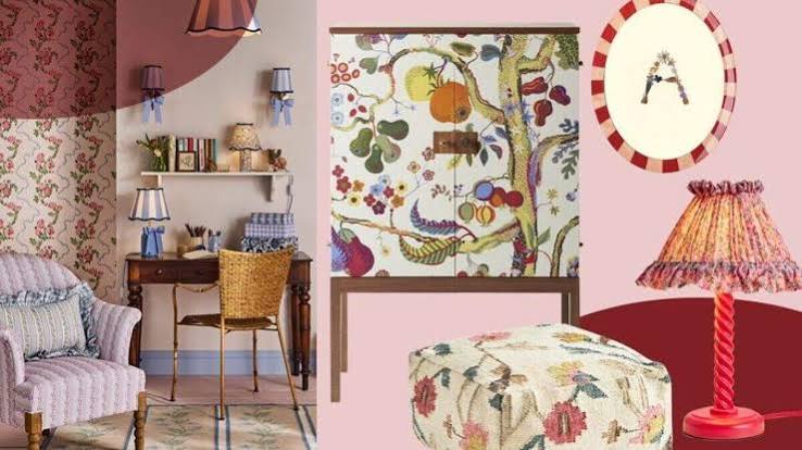
In 1996, IKEA ran a British advertising campaign urging shoppers to “Chuck Out Your Chintz,” featuring women literally tossing rose-print sofas and floral carpets into a dumpster, a stunt aimed squarely at killing a pattern the company saw as hopelessly dated. Three decades later, that same rose-and-leaf print is turning up specified in working designers’ plans rather than dragged to the curb. Heritage wallpaper houses that survived the anti-chintz years are reporting renewed demand for exactly the busy, botanical prints IKEA once mocked, and the shift is showing up in trade coverage rather than nostalgia blogs. The pattern that once signaled an outdated great-aunt’s guest room is being chosen on purpose, by people who could have picked anything.
The Backlash That Nearly Killed It
Chintz wallpaper and its matching fabrics peaked in the 1980s, when rose-covered walls, floral sofas, and matching curtains were a default look across a huge share of American and British homes rather than a niche choice. The style had deep roots by then. The word itself comes from the Hindi “chint,” meaning spotted, and the glazed cotton pattern traveled to Europe with Dutch and Portuguese traders in the 1600s, arriving in such quantity that England and France banned its import for roughly seventy years to protect their own textile makers, according to a design history from 1stDibs. Jackie Kennedy’s 1962 White House bedroom redesign, built around an orange-blossom chintz print, later helped popularize the look on both sides of the Atlantic, and Princess Diana’s use of it through the 1980s pushed its popularity further, per the same account. By the mid-1990s, that same ubiquity had curdled into cliche, and IKEA’s campaign became shorthand for an entire design era’s rejection of busy florals in favor of clean, minimal rooms.
Why Working Designers Are Specifying It Again
Helen Ashmore, head of design at Laura Ashley, told Country & Town House that “trends are shifting away from clean, minimal interiors; chintz is back in a big way,” pointing to a broader appetite for the “vintage feel” that comes from layering and mixing pattern rather than smoothing it away. Wil Law, a home design stylist at John Lewis, offered a related explanation in the same piece, crediting increased time spent at home with new demand for “stimulation and interest” through florals, leaf trails, and animal prints that evoke an English countryside look rather than a showroom. Neither designer framed the return as pure nostalgia. Both described it as a reaction against the flat, low-pattern rooms that had dominated the previous decade.
The Wallpaper Houses Leading the Comeback
The brands doing the actual printing back up what the designers are describing. Rebecca Craig, lead designer at Sanderson, told Country & Town House that “botanical designs continue to perform strongly” across the company’s current catalog, part of a wider move toward heritage patterns reworked for contemporary rooms. Chloe Vince, senior decorating consultant at House of Hackney, described nature-inspired wallpaper in the same piece as a source of “escapism” that lets homeowners express identity through pattern rather than paint alone. Firms including Soane Britain and Colefax & Fowler, both with roots in traditional English chintz, have kept rose-and-leaf prints in active production through the years the look was considered unfashionable, positioning them to meet the renewed demand rather than chase it from scratch.
What Flat Walls Were Missing
Part of the case for busy florals is practical as much as sentimental. Chintz’s signature glazed finish was originally prized by Victorian households because it wiped clean easily, a durability feature as much as a decorative one, per the 1stDibs history of the fabric. The pattern itself, dense with overlapping roses and leaves, was designed from the start to carry color and contrast across a large surface without a single flat plane. Designers now specifying rose-and-leaf prints are often chasing that same density, using the pattern to add texture and visual movement to walls that would otherwise read as blank. That’s a different rationale than “it’s back because it’s old,” and it’s why the current wave is showing up in working portfolios rather than costume-party decor.
The wallpaper IKEA once told an entire country to throw away didn’t get better while it sat in a warehouse. Designers just stopped confusing “dated” with “wrong,” and started treating a pattern built to catch light as a solution rather than a punchline.

Leave a Reply