
Search interest in rust as a color choice is up 178 percent over the past year, according to Houzz’s own 2026 trend research — a bigger jump than chocolate brown (up 153 percent) and roughly triple the increase for sage (up 55 percent). Of every color a person could be typing into a search bar right now, the one climbing fastest is a shade most closely associated with a single decade: the burnt-orange, harvest-gold-adjacent 1970s, the era interior design spent the 2000s and 2010s trying hardest to distance itself from.
The Numbers
Houzz’s research, published in its “8 Design Trends Emerging in 2026” report, tracks search activity across its own platform rather than sales data, which makes it a read on what homeowners and renovators are actively hunting for, not just what’s already selling. Rust’s 178 percent increase sits inside a broader cluster of warm, earthy colors all trending upward together — chocolate brown, mushroom, sage, taupe, and cream all posted meaningful gains in the same period, according to the same report. Forbes’ summary of Houzz’s broader findings describes the palette forming around these searches as pairing “warm yellows — ocher, mustard, honey — with rust, burgundy, and rich browns” for what the report calls an “understated and comforting” layered look, alongside traditional colors like olive green and deep brown.
Why Rust Specifically, and Why Now
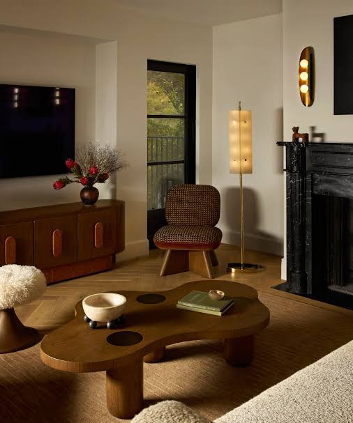
Rust never fully vanished the way avocado green or harvest gold did — it lived on quietly in leather furniture and fall-themed decor even during the gray-and-white decade design just came out of. What’s changed is its status: instead of a seasonal accent color trotted out every October, it’s showing up as a primary palette choice for full rooms, paired with materials like waxed leather, brushed brass, and dark wood that were also 1970s-era staples. That combination of color and material moving together, rather than rust appearing alone against an otherwise neutral room, is what separates this from a passing accent-pillow trend.
How the Color Actually Reads in a Room
Unlike a true orange, rust carries enough brown and red in its undertone to function as a neutral in the right context — it can anchor a room the way navy or forest green does, rather than acting purely as an accent. It photographs particularly well against warm wood tones and brass hardware, which is part of why it pairs so naturally with the broader earth-tone comeback Houzz’s data shows happening alongside it. Against cooler grays or stainless steel, though, rust can read as clashing rather than warm — the color leans hardest into “retro comfort” and hardest away from “cold modern” when the materials around it are equally warm.
Where to Actually Use It
A full rust-walled room is a real commitment, and most designers pulling this color into projects right now are starting smaller: a rust velvet or leather sofa as the room’s single big-ticket anchor, rust ceramic dinnerware and glassware in an open kitchen, or a rust front door and cabinetry as an exterior or kitchen accent rather than a whole-house palette. Because the color reads as warm rather than bright, it tends to layer well with pattern — a rust base with a smaller-scale print in cream, mustard, or brown avoids the flat, one-note look a single saturated color can fall into on its own.
What the Trend Line Is Actually Showing
A 178 percent jump in one color’s search volume, happening at the same time as gains across an entire warm, earthy family of colors, points to something bigger than one shade coming back into fashion. It reads as a genuine palette shift away from the cool grays and whites that dominated the past fifteen years of American interiors, back toward colors that photograph less like a showroom and more like a room someone has actually lived in for a while.

Leave a Reply