

Even a freshly cleaned home can look tired if the décor quietly broadcasts another decade. Designers say certain choices, from thrifted accessories to living room layouts, are reliable clues that a space has not been updated in years. By spotting these specific mistakes and swapping them for more timeless alternatives, you can make your rooms feel current without starting from scratch.
1) Clinging to Dated Thrift Store Lamps
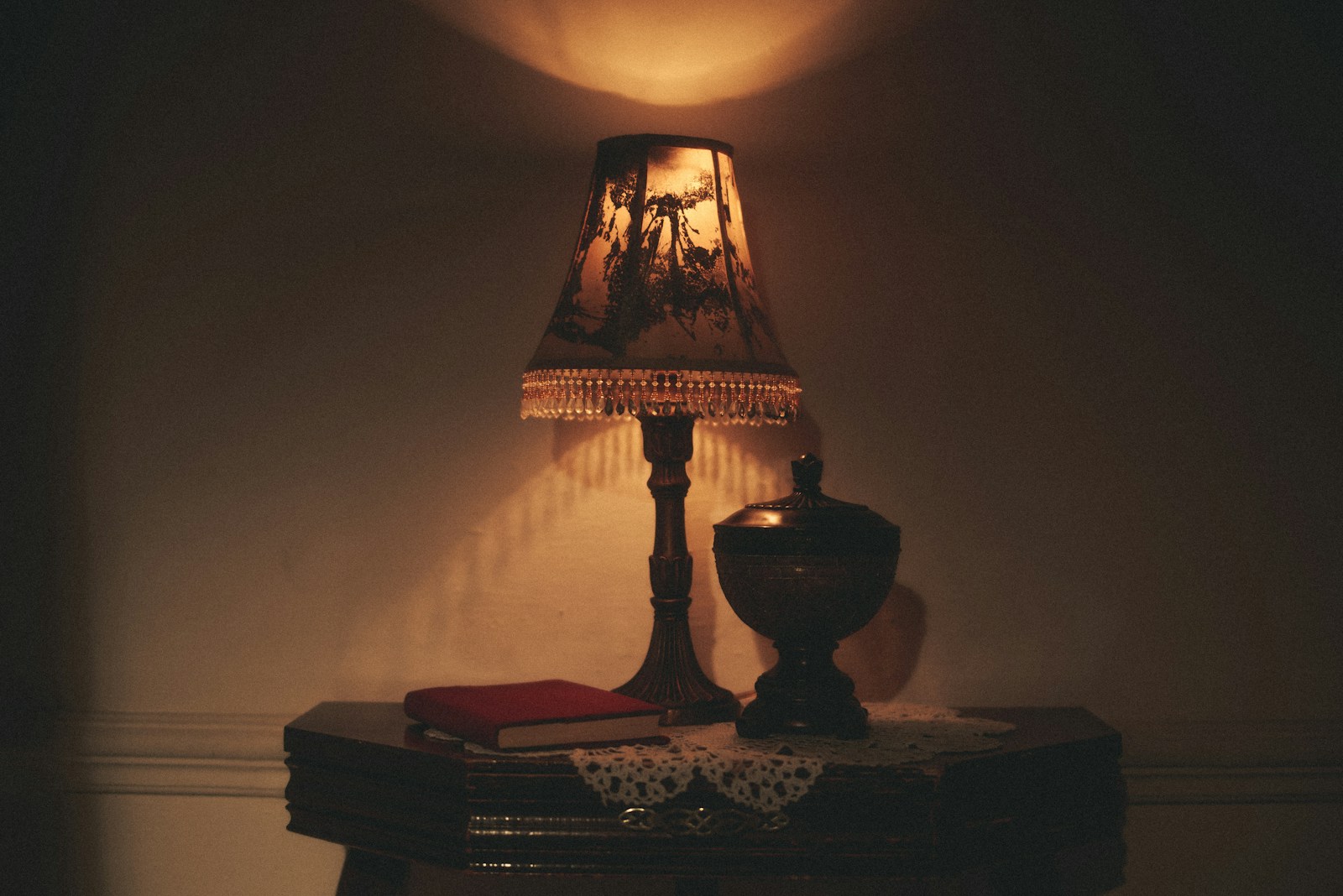
Clinging to dated thrift store lamps is one of the fastest ways to make a room feel frozen in time. Designers who study common thrifted finds warn that certain secondhand lighting, especially fussy brass bases, pleated shades, and overly ornate silhouettes, instantly reads as “stuck in the past.” When a lamp’s style is tied to a specific era, it pulls the entire room back with it, no matter how new your sofa or rug might be.
Instead of keeping every bargain lamp, experts suggest treating lighting as a key style anchor. Simple drum shades, clean-lined ceramic bases, and updated finishes like matte black or soft white feel more timeless and let other pieces shine. The stakes are high because lamps sit at eye level and are used daily, so outdated shapes and finishes quietly signal that the rest of the home has not been refreshed either.
2) Overloading with Generic Thrifted Artwork
Overloading your walls with generic thrifted artwork can also date your home quickly. Designers who evaluate Thrifting habits say mass-produced prints, faux oil paintings in heavy frames, and faded landscapes are common secondhand scores that rarely age well. When every wall is covered in these pieces, the effect is less curated gallery and more mismatched time capsule, especially if the colors echo trends from decades like the 1980s or early 2000s.
To keep your space from feeling like a resale shop, treat art as a deliberate collection rather than filler. Mix a few meaningful vintage finds with contemporary prints, family photos, or even children’s drawings in simple frames. This shift matters because artwork sits at the center of sightlines; if it looks generic and tired, visitors assume the rest of the décor is equally dated, no matter how carefully you have updated other elements.
3) Ignoring Modern Rug Placement in Living Areas
Ignoring modern rug placement in living areas is another subtle mistake that makes a home look dated. Interior Designers consistently call out rugs that are too small for the room, with furniture floating around the edges, as a top culprit in dated living rooms. That undersized look recalls older decorating advice and makes the space feel visually chopped up, even if every piece of furniture is brand new.
Current guidance favors rugs large enough that at least the front legs of sofas and chairs sit on the pile, creating a unified seating zone. When you correct the scale, the room immediately feels more intentional and contemporary. The stakes go beyond aesthetics, because a properly sized rug also improves traffic flow and comfort, signaling that the layout has been thoughtfully updated rather than inherited from a previous era.
4) Mismatching Furniture Styles Without Intention
Mismatching furniture styles without intention can make your living room feel like a leftover showroom. Experts who outline Common Home Decor Mistakes That Make Your Home Look Dated, And How to correct them note that both overly matchy sets and haphazard mixes age a space. When you combine a traditional rolled-arm sofa, a sleek glass coffee table, and rustic side chairs with no shared color, finish, or era, the result reads as accidental rather than eclectic.
Designers recommend repeating at least one element, such as wood tone, metal finish, or fabric color, across pieces so the mix feels cohesive. This matters because a disjointed furniture story suggests you have been layering random hand-me-downs for years. A more edited, intentional combination signals that you understand current design principles and have refreshed your home thoughtfully instead of letting it drift into visual clutter.
5) Sticking to Builder-Grade Light Fixtures
Sticking to builder-grade light fixtures is a classic sign that a home has not been updated since move-in day. Specialists who list Most Outdated Items in a house point out that basic flush mounts, dated chandeliers, and generic vanity bars are among the first elements that reveal a room’s age. When those fixtures echo trends like shiny brass or frosted tulip shades, they immediately recall older construction and renovation cycles.
Swapping even a few key fixtures for simple, current designs in black, white, or soft brass can transform how updated your rooms feel. Because lighting sits at the intersection of function and style, outdated pieces do more than dim your space, they signal that other systems, from paint colors to hardware, may also be lagging behind. A quick fixture upgrade is one of the most efficient ways to reset the visual timestamp of your home.
6) Using Visible Cheap Wiring and Cords
Using visible cheap wiring and cords is a tacky design error that instantly cheapens a room. Reporting on tacky interior design errors rich people never make notes that affluent homeowners avoid dangling extension cords, power strips piled in corners, and TV cables snaking down the wall. These details draw the eye away from architecture and furnishings, making even high-end pieces feel less luxurious.
Concealing cords with cable covers, routing them behind furniture, or investing in in-wall solutions immediately elevates the space. The stakes are not just visual; exposed wiring can also raise safety concerns and suggests a temporary, makeshift approach to living. When cords are managed thoughtfully, the room reads as finished and intentional, which is a hallmark of homes that feel timeless rather than dated.
7) Opting for Fake Plants Over Real Greenery
Opting for fake plants over real greenery is another choice that can date your décor. Analysts who catalog cheap, low-end design moves explain that artificial foliage often has an unnaturally shiny finish, stiff leaves, and dust-catching crevices that reveal its age over time. When these faux plants dominate shelves and corners, they recall older decorating trends that prioritized maintenance-free greenery over authenticity.
Real plants, even low-maintenance varieties like snake plants or pothos, bring movement and subtle imperfections that feel current and alive. If live greenery is not practical, higher-quality faux options used sparingly are better than a house full of plastic. The broader implication is that your home appears more cared for and up to date when natural elements are part of the mix, signaling that you are engaged with how the space looks and feels today.
8) Layering Too Many Patterned Throw Pillows
Layering too many patterned throw pillows can quickly push a living room into dated territory. Experts who outline Avoid the most common living room mistakes note that bold, busy patterns in large numbers overwhelm the eye and often reflect past trend cycles. When every pillow features a different print, color, and trim, the sofa starts to feel like a collage of old trends rather than a cohesive seating area.
A more current approach is to limit the palette and mix only a few patterns with solid textures, repeating colors across the room. Editing down also makes the furniture more comfortable to use, which subtly communicates modern, livable design. The stakes are higher than they seem, because pillows sit front and center in photos and first impressions, so an overstuffed, mismatched arrangement can make the entire room feel stuck in an earlier era.
9) Neglecting Neutral Walls for Bold, Faded Colors
Neglecting neutral walls in favor of bold, faded colors is a final mistake that dates a home. Design pros who compile 40 elements that age interiors note that saturated hues tied to specific decades, especially once they fade or scuff, are a giveaway that paint has not been refreshed. When walls still sport deep burgundy, mustard, or heavy orange tones, they echo older trends like The Old World palettes and make newer furnishings feel out of place.
Soft neutrals, including warm whites and gentle greiges, provide a more timeless backdrop and let art, textiles, and furniture carry color. Repainting is labor intensive, but it dramatically shifts how updated your home appears and can even highlight architectural details that were previously lost. For buyers, guests, and even your own daily experience, fresh neutral walls signal that the space is maintained and aligned with current design standards rather than lingering in the past.
Leave a Reply