
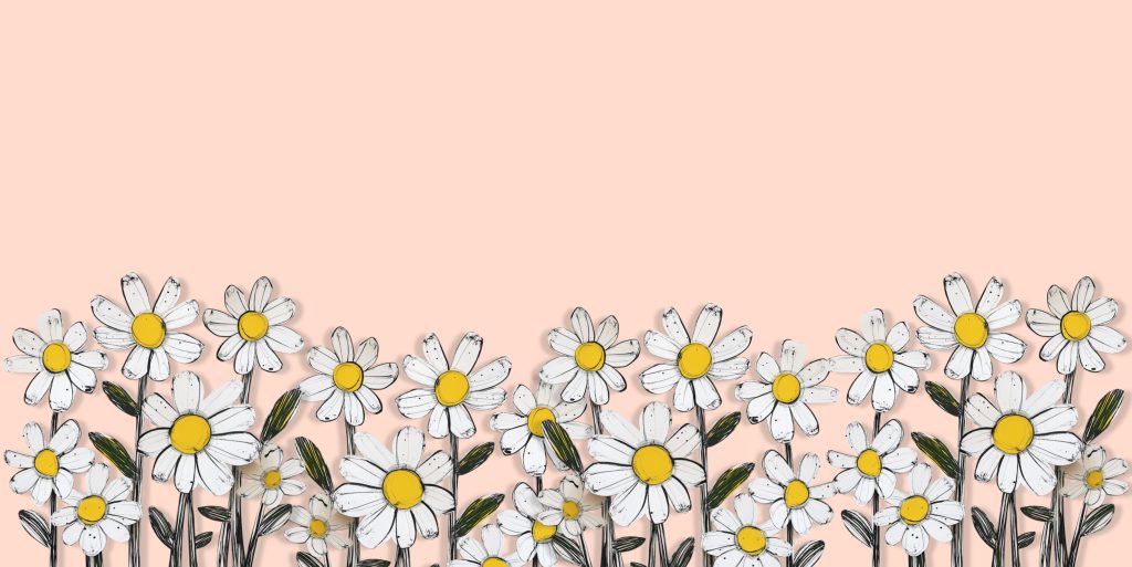
Color plays a pivotal role in setting the mood of a space. It can evoke feelings of warmth, joy, comfort, or serenity. Among the infinite spectrum of shades and tones, there are some that carry with them a delightful sense of nostalgia. These retro color palettes, hailing from the mid-century era to the ’80s, possess a timeless charm that still feels fresh in contemporary homes.
As an interior design enthusiast, I’ve curated a list of seven such retro color palettes, each holding a unique blend of vintage charm and modern appeal. Let’s dive in and discover how these classic color schemes can infuse your home with retro flair.
Mustard Yellow and Avocado Green
Nothing screams ’70s more than a blend of mustard yellow and avocado green. This color combination is both cheerful and calming, reminiscent of the bohemian vibes of the era. Mustard yellow, a warm and inviting hue, pairs beautifully with the earthy and soothing avocado green, creating a harmonious balance that breathes life into any space.
Try incorporating these colors through accent pieces, like cushions or rugs, or go bold with larger furnishings or wall paint. The key is to balance these vibrant hues with neutral tones to avoid over-saturation.
Teal and Coral
The vibrant mix of teal and coral harks back to the upbeat aesthetic of the ’50s and ’60s. Teal, with its cool, rich undertones, offers a striking contrast to the warm, energetic vibe of coral, resulting in a dynamic and invigorating palette.
These colors work beautifully in kitchens and bathrooms or as accent colors in living rooms or bedrooms. When working with this palette, consider the 60-30-10 rule: 60% dominant color (teal), 30% secondary color (coral), and 10% accent color (white or cream).
Millennial Pink and Grey
Even though millennial pink is a recent trend, it has a distinct retro feel, reminiscent of the pastel craze of the ’80s. Paired with grey, it creates a soft, romantic, and modern palette that can easily translate into a chic and cozy space.
This palette is versatile and can work in any room. Consider a millennial pink sofa against a grey wall for a statement living room piece, or for a more subtle approach, opt for pink accessories in a predominantly grey bedroom.
Orange and Brown
The warm, earthy tones of the ’70s are making a comeback, with orange and brown leading the charge. This color combination exudes a cozy, rustic charm that can instantly make a space feel more welcoming.
Try using these colors in your living room or dining area for a hospitable atmosphere. Balance the robust orange with a soft, neutral brown, or reverse the roles for a more dramatic effect.
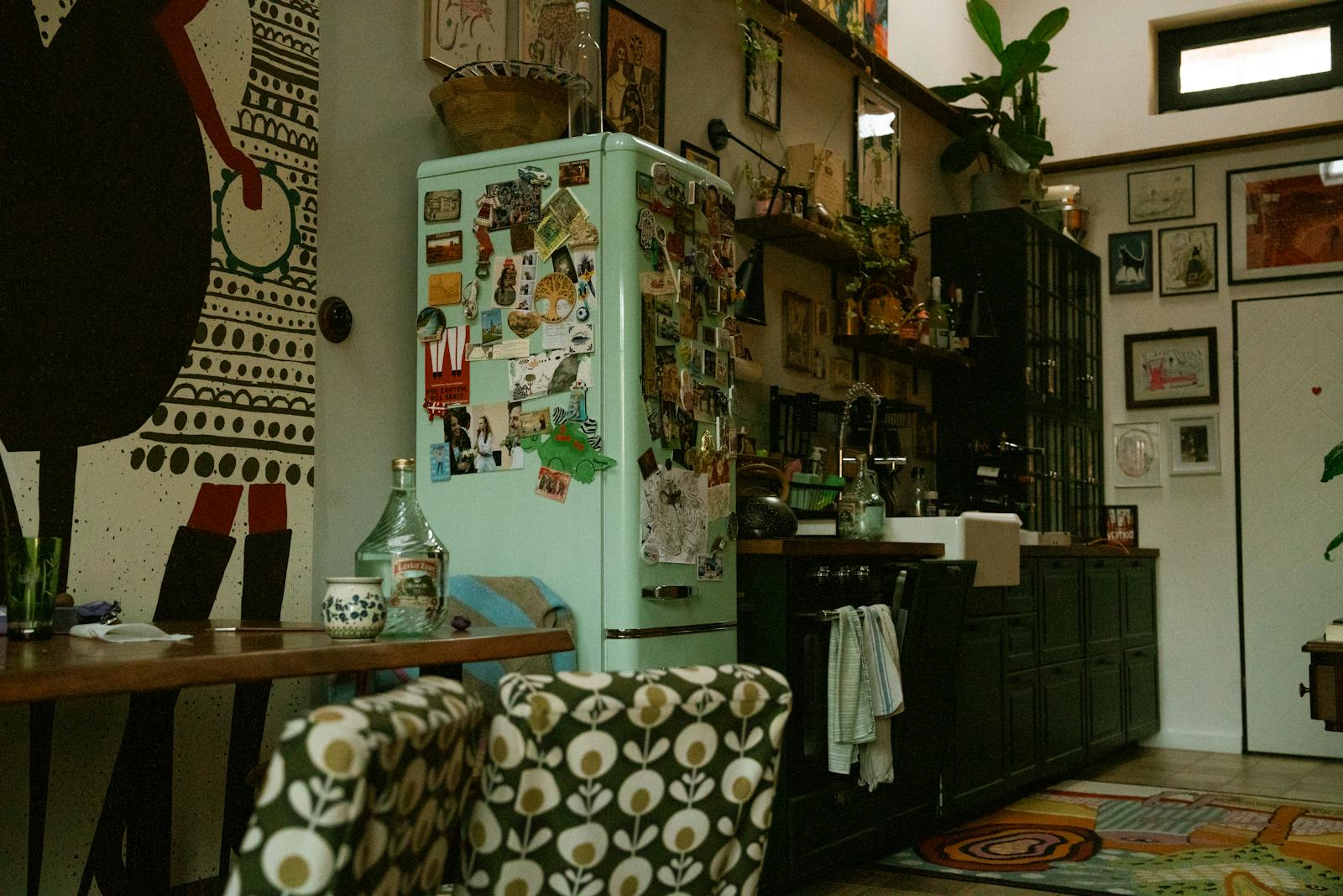
Mint Green and White
The refreshing blend of mint green and white transports us to the retro kitchens of the ’50s. This palette, with its clean and airy vibe, can make your space appear brighter and more spacious.
This color scheme works exceptionally well in kitchens and bathrooms, often paired with checkered black-and-white floors or subway tile. Use white as your dominant color and mint green for cabinetry or accents to maintain a light and fresh aesthetic.
Navy Blue and Gold
The sophisticated pairing of navy blue and gold is reminiscent of the luxury and opulence of the Art Deco era. The deep, calming navy blue contrasts beautifully with the luminous, luxurious gold, creating a palette that is both elegant and striking.
This color scheme works well in upscale spaces like living rooms or master bedrooms. Consider navy blue walls with gold accents in lighting or accessories for a truly opulent aesthetic.
Red and Turquoise
The playful mix of red and turquoise brings to mind the eclectic style of the ’50s. The bold, energetic red perfectly counters the soothing, tropical turquoise, creating a color palette that is lively and balanced.
To incorporate these colors, consider a turquoise accent wall with red furniture or accessories. Alternatively, in a neutral space, use these colors in patterns or prints to add a touch of retro charm.
As we journey through these retro color palettes, it’s clear that what was once old can certainly be new again. The key is in understanding the balance and harmony of these colors and how they can be incorporated into your contemporary space. So why not bring a touch of the past into your home and let these charming hues tell their own story?
Leave a Reply