


Album covers have long been more than just protective sleeves for records—they can be powerful visual statements that capture the essence of the music inside. When a cover becomes a work of art, it creates a memorable connection between you and the album before you even press play.
You’ll discover how certain record covers stand out because their design or artwork carries its own artistic value, making them pieces worth admiring on their own. These covers often combine creativity, cultural significance, and striking visuals to leave a lasting impression.
Pink Floyd – The Dark Side of the Moon (Storm Thorgerson)
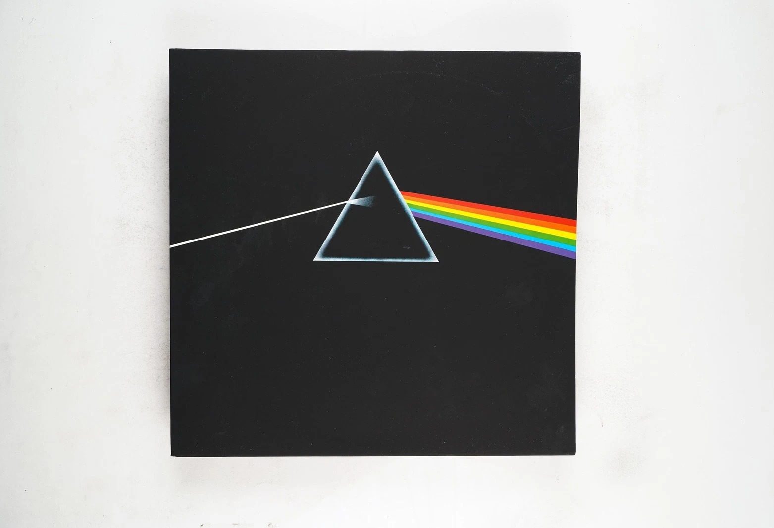
When you look at The Dark Side of the Moon cover, you see a simple prism dispersing light. It’s a clean design, but it speaks volumes about the album’s themes.
Storm Thorgerson, the designer, wanted something timeless and iconic. His work with Pink Floyd is legendary, and this cover is one of his most recognized pieces. You can explore more about his art for Pink Floyd here.
The Velvet Underground & Nico (Andy Warhol)
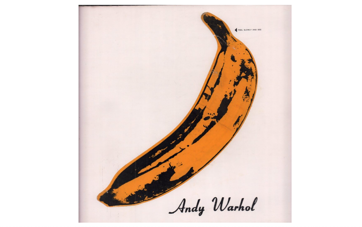
You’ve probably seen the iconic banana on the cover of The Velvet Underground & Nico. This simple yet striking image was designed by Andy Warhol, who also produced the album.
Your copy might even have the peel-to-reveal feature, inviting you to interact with the art. Warhol’s design helped the record stand out as both music and visual art.
You can learn more about this unique cover and its impact at this detailed Andy Warhol and the Velvet Underground & Nico.
The Rolling Stones – Sticky Fingers (Andy Warhol)
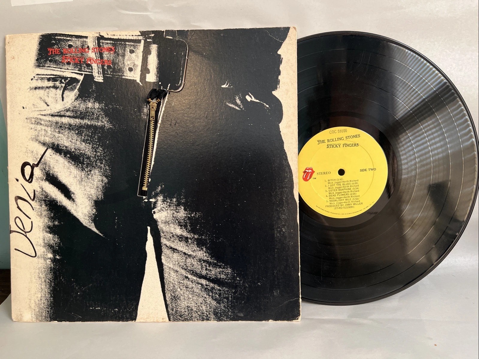
If you’ve seen the album Sticky Fingers, you’ve seen Andy Warhol’s iconic touch. The cover features a close-up of denim jeans with a working zipper you could actually unzip.
Warhol’s design was a bold and playful idea, making your experience with the album unique. It’s a perfect example of art meeting music visually. You can learn more about this collaboration here.
Kanye West – Graduation (Takashi Murakami)

When you look at the cover of Kanye West’s Graduation, you’ll notice its bright, playful style. This artwork was created by Takashi Murakami, a famous contemporary artist known for merging fine art with pop culture.
Murakami’s design draws from the Superflat movement, blending anime and manga influences. It adds an energetic and unique vibe that matches the album’s bold sound. You can see why this cover stands out as a true piece of art.
Learn more about the creative process behind it at CD Unity.
Michael Jackson – Dangerous (Mark Ryden)

You’ll notice that the cover of Michael Jackson’s Dangerous is full of intricate details. Mark Ryden, the artist, spent six months creating this artwork.
The cover reflects Michael Jackson’s life in a surreal, almost cartoonish style. You can explore more about Ryden’s work and sketches from this project on his Instagram.
Prince – Lovesexy (Jeffrey Fulvimari)
You’ll notice the “Lovesexy” cover is bold and bright. It features Prince in a striking pose, with intricate body paint that looks like flowing light.
Jeffrey Fulvimari’s photography captures energy and movement, making the album feel alive. This cover invites you to explore the music’s blend of funk, spirituality, and passion through its vivid art.
Nirvana – Nevermind (Robert Fisher)

When you look at Nirvana’s Nevermind cover, you’re seeing the work of Robert Fisher. He was the art director who brought Kurt Cobain’s idea to life.
You might not know that the famous underwater baby photo was chosen with Fisher’s guidance. His design helped make this cover iconic and instantly recognizable.
If you want to explore more about Fisher’s role, check out his story in this design archive article.
David Bowie – Aladdin Sane (Brian Duffy)

When you see the Aladdin Sane cover, you’re looking at one of the most iconic images in music history. Photographer Brian Duffy captured Bowie’s electrifying lightning bolt look in 1973.
This image isn’t just a photo; it’s a bold expression of Bowie’s artistic style at the time. You can explore more about this iconic photo here.
Radiohead – Kid A (Stanley Donwood)

When you look at Kid A’s cover, you see a haunting, apocalyptic landscape. Stanley Donwood created these visuals with Thom Yorke, capturing the album’s eerie, experimental vibe.
You can even find some of the original pieces going up for auction, showing how the artwork stands on its own as impactful art. This cover really sets the tone for your listening experience.
Learn more about Donwood’s work with Radiohead here.
Beastie Boys – Licensed to Ill (Stephen Byram)

When you look at Licensed to Ill, you’ll notice Stephen Byram’s clear art direction. The famous cover features original concept art by David Gambale, also known as World B. Omes.
You might enjoy how the illustration board’s grey tones give it a unique, bold vibe. This cover remains one of the most recognizable in hip-hop history. Learn more about the artwork on this Licensed to Ill album page.
Public Enemy – Fear of a Black Planet (Chuck D & Hank Shocklee)

When you look at Fear of a Black Planet, you see more than just an album cover. Chuck D and Hank Shocklee crafted imagery that matches the powerful messages inside.
The artwork grabs your attention with bold visuals reflecting the album’s themes on race and culture. It’s a striking piece that invites you to explore the music’s depth.
You can appreciate how the cover complements the sound, making it a true work of art. For more details, check out the Fear of a Black Planet release.
Beyoncé – Lemonade (Alan Ferguson)

You’ll find that the cover of Beyoncé’s Lemonade is more than just a photo—it’s a powerful statement. Shot by Alan Ferguson, it shows Beyoncé with a fierce, intense gaze that draws you in.
The art captures the themes of strength and vulnerability you’ll hear throughout the album. It perfectly sets the tone for the visual and musical journey ahead. You can explore more about the album’s visuals here.
Bad Bunny – YHLQMDLG (Alvaro Díaz)
When you see the cover of Bad Bunny’s YHLQMDLG, you’ll notice the bright pink hue that instantly grabs your attention. Alvaro Díaz’s design gives it a fresh, playful vibe that matches Bad Bunny’s bold personality.
The cover feels modern yet simple, letting you focus on the artist’s confident look. It’s a great example of how clean design can still make a strong statement.
The Sex Pistols – Never Mind the Bollocks (Jamie Reid)

When you see the cover of Never Mind the Bollocks, you’re looking at Jamie Reid’s bold design. His use of bright colors and ransom-note style lettering made the album instantly recognizable.
The artwork matches the rebellious spirit of the Sex Pistols perfectly. You can explore more about his work on the original artwork for this iconic album here.
Leave a Reply